![]() If you jumped into the Atlantic ocean and walked along the bottom, eventually you’d make it to the shores of good ol’ England: home to artist Ryan Quickfall. If you then had the opportunity to climb inside Ryan’s head to look through his eyes, everything in view would suddenly age, and all the colors would shift out of alignment. Big chunky halftones devour the shadows.
If you jumped into the Atlantic ocean and walked along the bottom, eventually you’d make it to the shores of good ol’ England: home to artist Ryan Quickfall. If you then had the opportunity to climb inside Ryan’s head to look through his eyes, everything in view would suddenly age, and all the colors would shift out of alignment. Big chunky halftones devour the shadows.
You quickly notice that the buildings in town have developed long creases across them, and they appear as if they were torn from the pages of an old magazine. Suddenly, you realize that your childhood home has been torn down to make way for a motorcycle dirt track; as were your friend’s homes, your school, and all the places that you use to hang out at! In fact, the whole damn world seems to have transformed into a series of monstrous flat tracks! One course intersects with the next, only to be broken up by the appearance of GP circuits that are ruled by rabid packs of fuel-soaked racers. The air is thick with immense clouds of dust and exhaust fumes, while the painful howls of screaming motors and shrieking fans fill your blood soaked ears. It’s a friggin’ mad house! A maaaaaaad house… hey! Dude! You nearly ran me the fuck over!
Damn, I started spacing out again. The reason we’re here is for that interview… the one with the awesome Ryan Quickfall. Let’s get to it!
Hey Ryan! Let me dive right in and ask you about your appreciation for mid-twentieth century illustrations. Particularly, your love for the advertisements of that period, and the printing process itself. Can you remember what it was that attracted you to this period of art?
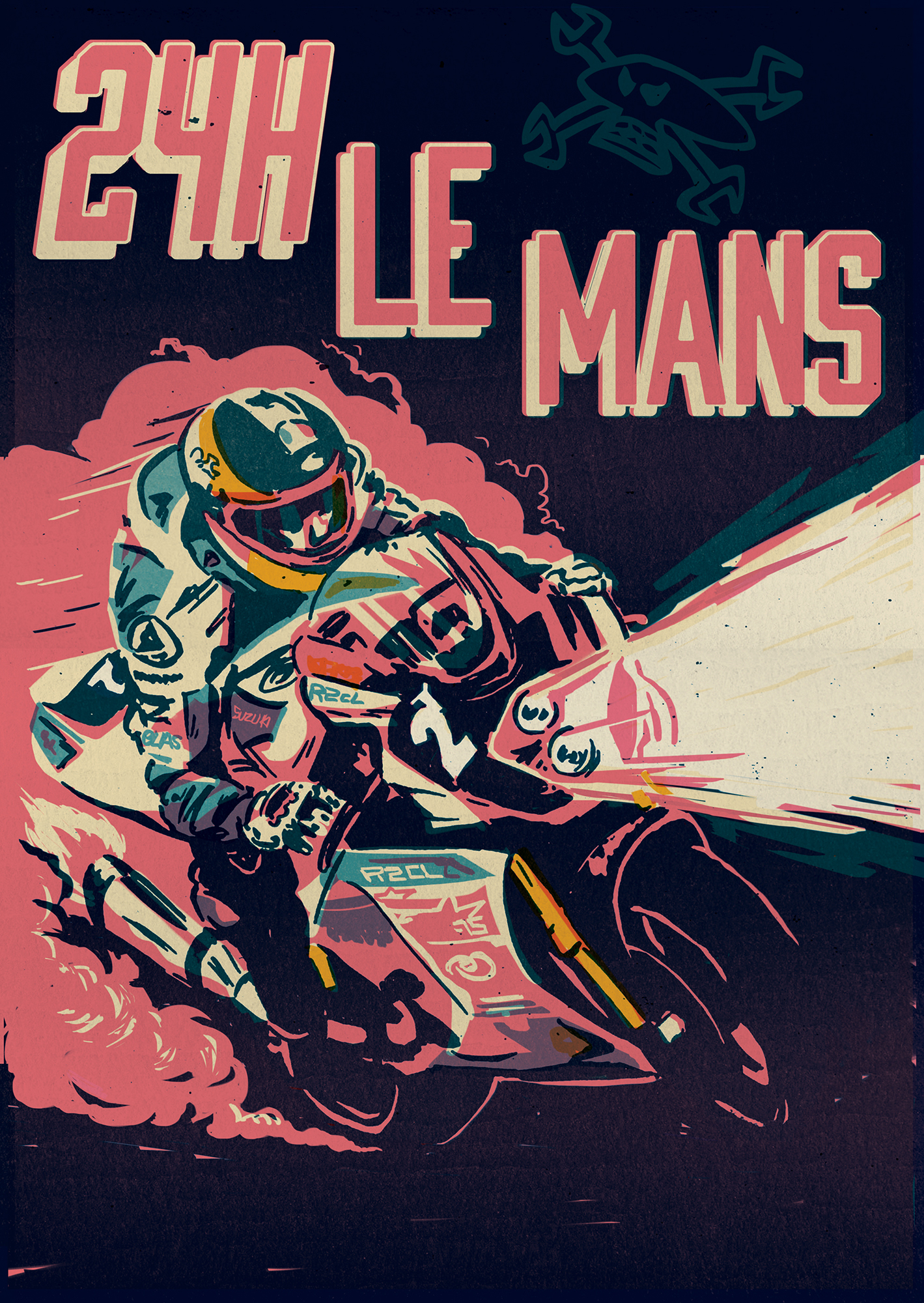
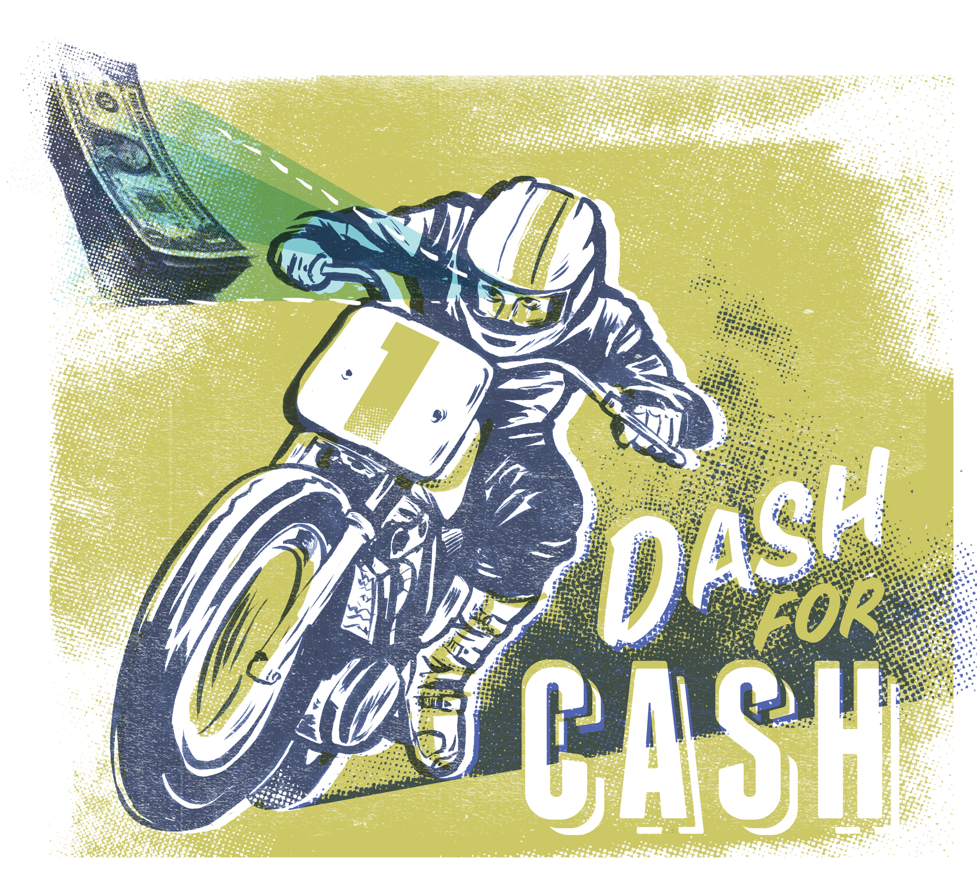
I really love the naivety of a lot of the adverts from that period. I don’t mean that in any offensive way at all, it just makes me laugh that a freckled kid with a big cheeky grin is going to convince me to buy the latest Remington. The content of the ads is great generally, and the characters and illustrations that are used are awesome. It’s a period before the digital process, so each piece was hand done, genuinely by hand! And that’s pretty rare now. I couldn’t design, plan, layout and execute an illustrated ad from scratch by hand today. I’d use a computer almost definitely. When you look closely at the print quality, and blow it up you see minor imperfections and a roundness to the type from the print process. I love this, I love all the imperfections, I love the overlaid and mis-registered colours. The digital design and print process has virtually eradicated any imperfections like you see from old ads. It’s great to see a hand made, yet mass produced piece of work. Ads from that period just had character. I think its funny that something that was just a piece of design and advertising, can now be seen as art. Studios like Morning Breath Inc take old ads and use them in their work today.
If one were to use a magnifying glass to look at an old magazine photo, or a panel from a comic book, you would see that the image is made up of hundreds of tiny dots. The next thing that you’d notice is the texture of the paper, and that the colors tended to be slightly out of registration. Your work often celebrates this process, and for me, that’s one of the things that makes your art so exciting! By bringing us that close to the page, it’s as if you grabbed us by the throat and tossed us right into the middle of the action. When did you start taking this approach with your art?
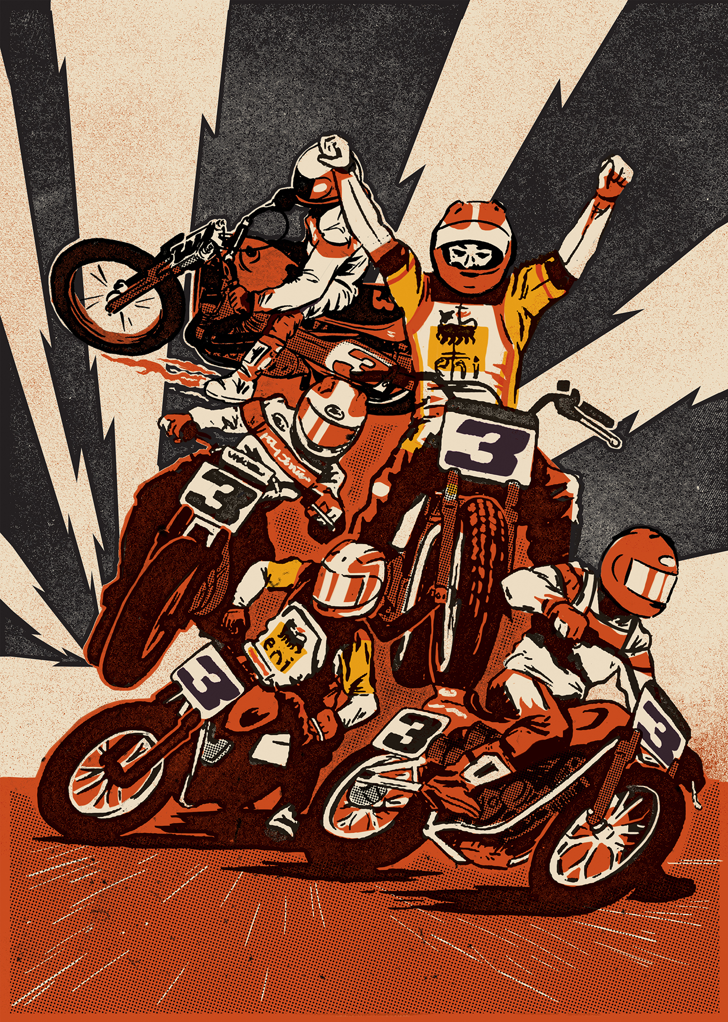
Well, firstly I know I’m not the only person building this nod to old processes into my work. There’s a lot of other people who like to overlay and intentionally build in mis-registration of colours. Which I think is probably an influence from comic books. I know it is for me. Everyone loved comics surely, and I think that the illustration and printing techniques from these old mags has filtered through to a lot of peoples work. I think for me it has gradually become more apparent in my work to the stage that I consciously try and build it in. From my digital illustration to screenprints. I love mis-registration, it pays homage in some way to an era of doing things with less accurate technology. I like that you mention bringing the viewer closer to the page. I hate it when you see a painting and from 6 feet away it looks absolutely perfectly executed, then when you step up close it looks like a paint by numbers. So I think its absolutely awesome that my work is being looked at in such close detail. That’s exactly what I want. Especially from my screenprinted pieces.
While we’re digging into your past, can you tell me where you grew up, and, if you can remember, what were the factors that led you towards an interest in art?
I grew up just west of Newcastle Upon Tyne, close to the city but also far enough out to be slightly in the sticks. So we could fly around the fields on dirt bikes without offending too many people! You know, I’ve been asked this a load of times and honestly I just don’t think there was actually a point I decided I was into art. I just was, and have drawn all of my life from as long as I can remember. Its even been the same with pursuing a career by putting pen to paper, there wasn’t really a conscious decision to do it. I just feel like I wouldn’t be suited to much else. I guess I just keep doing it because, I meet so many awesome people, get to work on some mega projects and I’ve plugged away for such a long time to earn a living from it that I’ve broken through that wall. And there’s no going back!
Who were some of your favorite artists growing up? Was there anyone in particular that pushed you towards taking art more seriously?
When I was younger, I really loved Ed Roth and all the 50 – 60s Kustom Kulture artwork. All crazy boggle eyed characters speeding along popping wheelies. I think seeing that sort of stuff as a kid makes you realize that making money from being creative, doesn’t have to be stiff and serious. I hate to call myself strictly a designer, because quite frankly there are far too many who never lift a pencil in their careers. And I think as a kid that’s not what I wanted, or even want now. You know, its weird because I don’t think there ever was a particular person who stands out that pushed me towards an art career. Obviously my family encouraged me to draw and I’d spend hours a day doing it, but prior to moving to college to study I cant think of anyone. It was just taken for granted that I would make money and a living out of being creative in some way. I also don’t think I ever said, I want to be an artist. I just took the courses, spent the time studying and, mainly plugged away until I gradually got more work. I have spent far more time earning jack shit, than I have being paid for work as a full-time job. But I’m not sure I take it quite seriously enough even now. I mean I give my clients 110% when I’m involved on a project. But at the end of the day, I draw and paint and create for a living. Which is absolutely awesome but I’m not saving lives! So you know, appreciate it but don’t take it too seriously, or you’ll lose the love for it.
Your work often focuses on motorcycles, particularly dirt trackers. How did your interest in bikes get started, and what are you riding these days?
Nobody really introduced me to bikes, I don’t think. As far as I remember it started with bicycles. Then as I grew up I got into BMX, and with the right people, it can easily take over your life! We were always scoping out new trails spots, digging them, maintaining them and then riding them ( which always seems to be the lesser spent time ) until inevitably they get trashed and you’re forced to move on elsewhere then repeat the process. Somewhere along the line I got a bit fed up of the same process happening and it coincided with getting my motorcycle licence. It just seemed like a natural progression and in fact I see more and more old friends who are stepping into Motorcycles from a time spent riding BMX. So I bought my uncles VRF400, spent a year on it. It got backed over by a truck and I bought a 99 model Yamaha R6 which I kept until late 2012. I loved that bike, it taught me a lot and went through a few nasty spills with me. But it never missed a beat! Anyway, I’m currently between bikes. (I don’t think anyone gives up motorcycles, they’re merely between bikes). I really have no idea what to do, I’m in no rush to make up my mind. Its tempting to just ride off road, especially with some of the driving I’ve seen in this country and the crashes I’ve been involved in on the road. Id really love to have a go at flat track, with the DTRA. It’s a pretty accessible sport and a really good crowd. We’ll see.
You do a lot of killer work for the magazine Sideburn. How did that relationship come about?
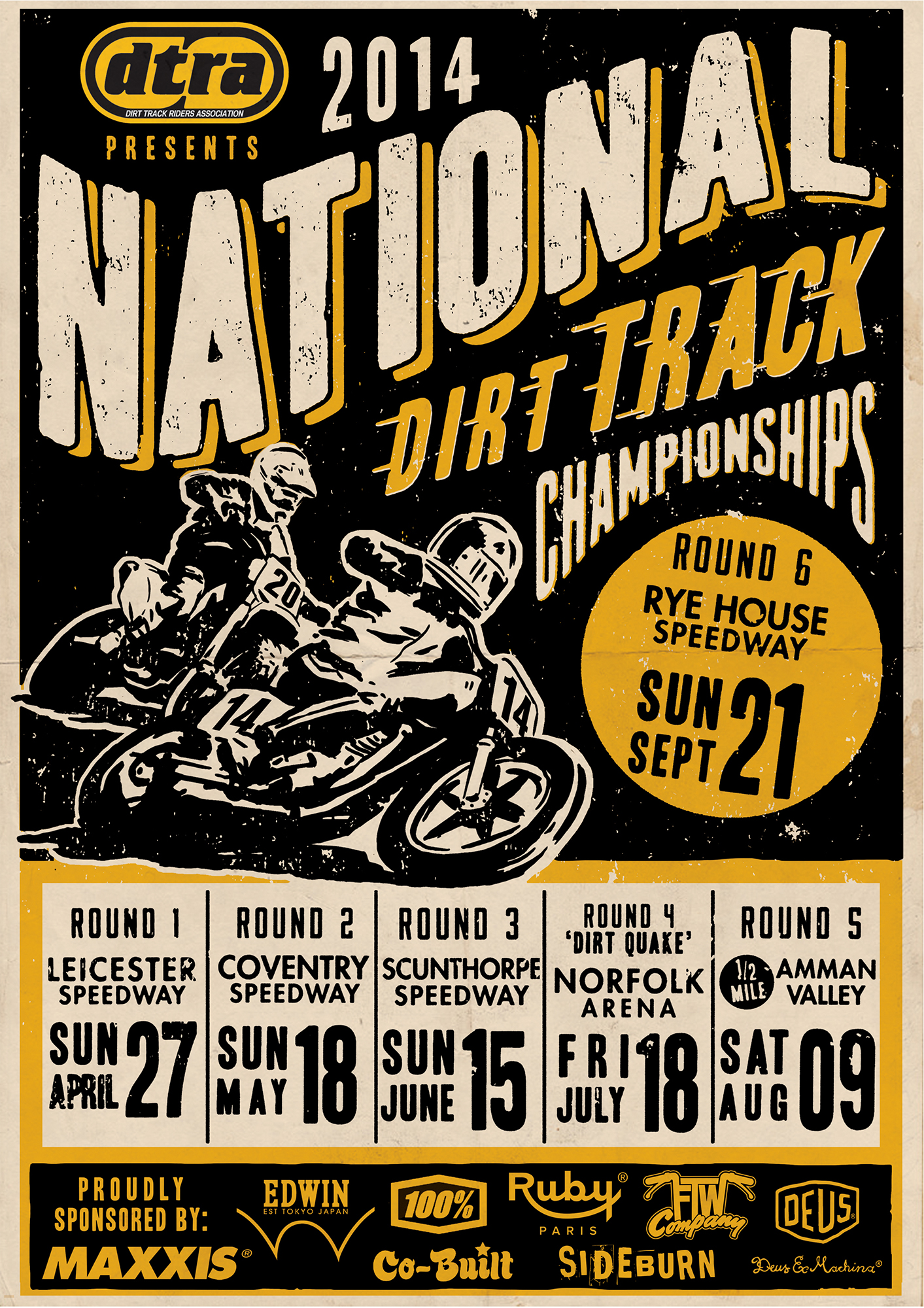
I’m really glad you mentioned Sideburn, I owe so bloody much to Gary and Ben. All of my work in the last couple years has spawned from a chance meeting with Gary Inman on Instagram. They commissioned me to do some illustrations for Sideburn articles, which led to tees and posters and now an ongoing relationship with the magazine and everyone else involved in it. I think Sideburn is such an exciting publication, in an exciting time right now, that the people involved in it are just as exciting!
Of all the pieces that you’ve created for them, are there any that you’re really proud of?
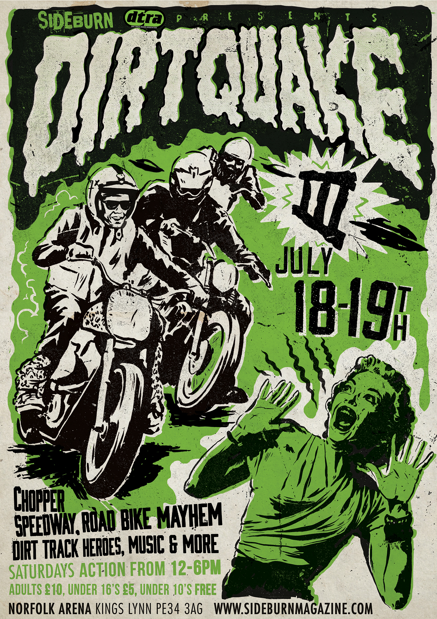
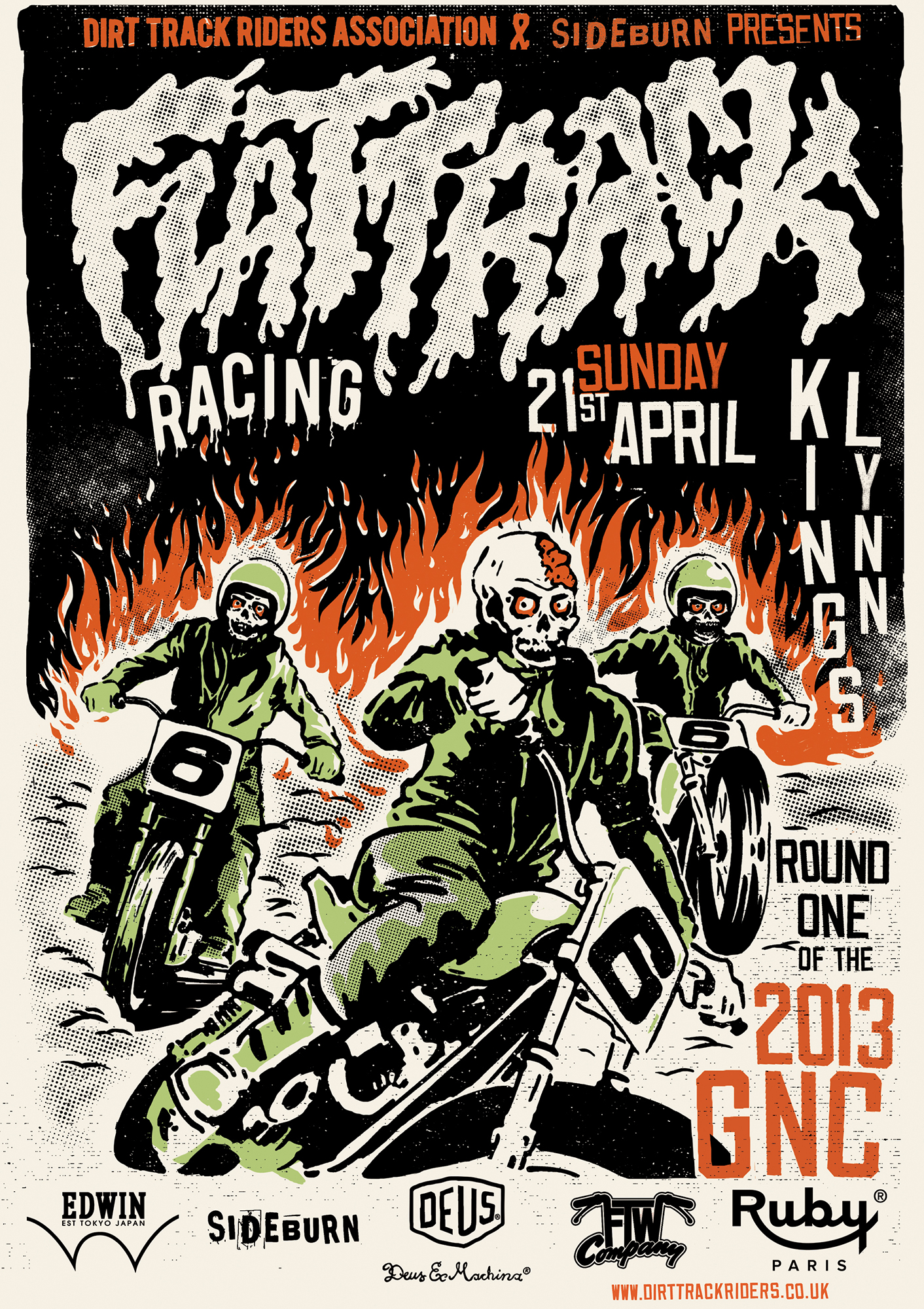
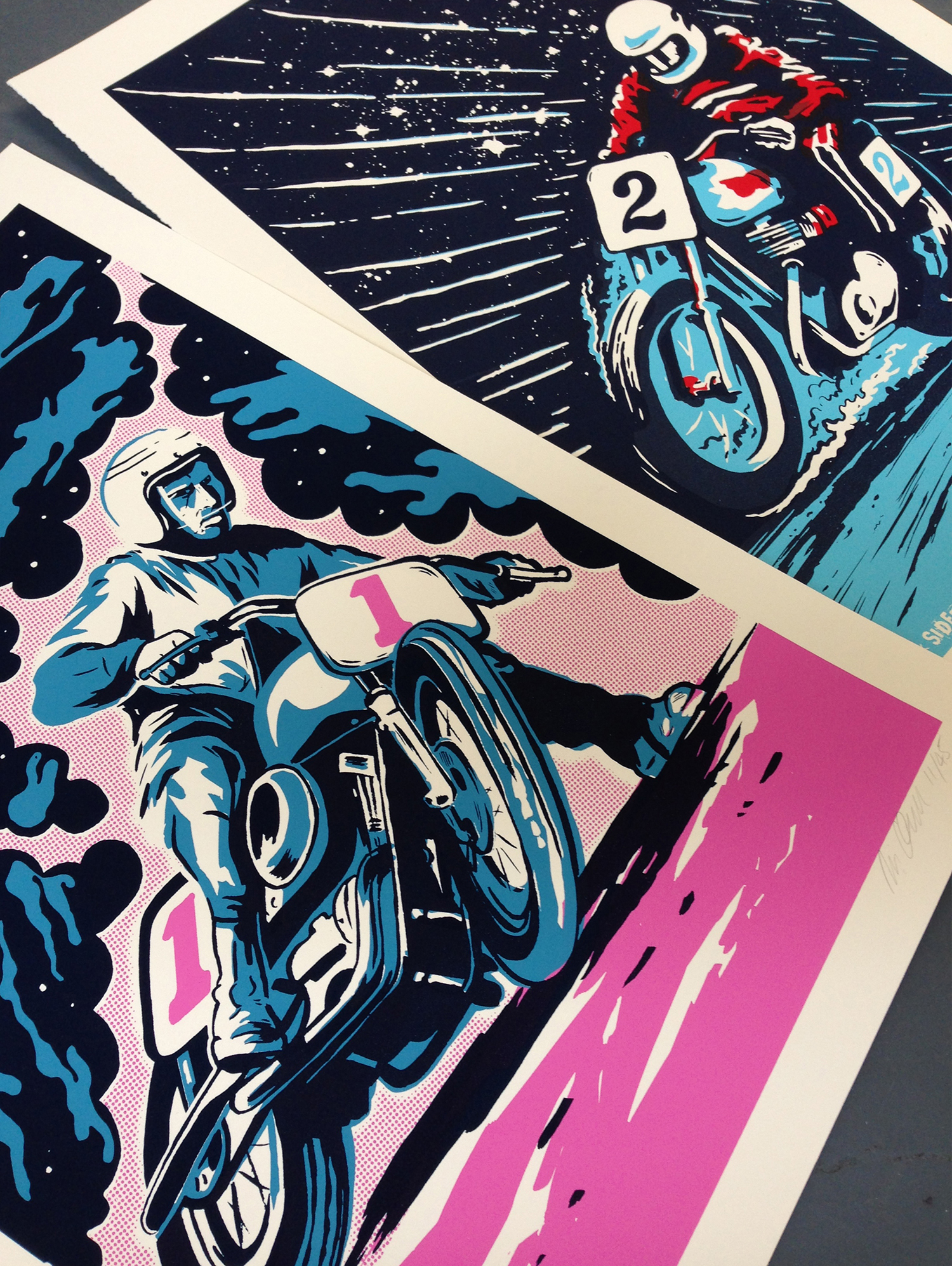
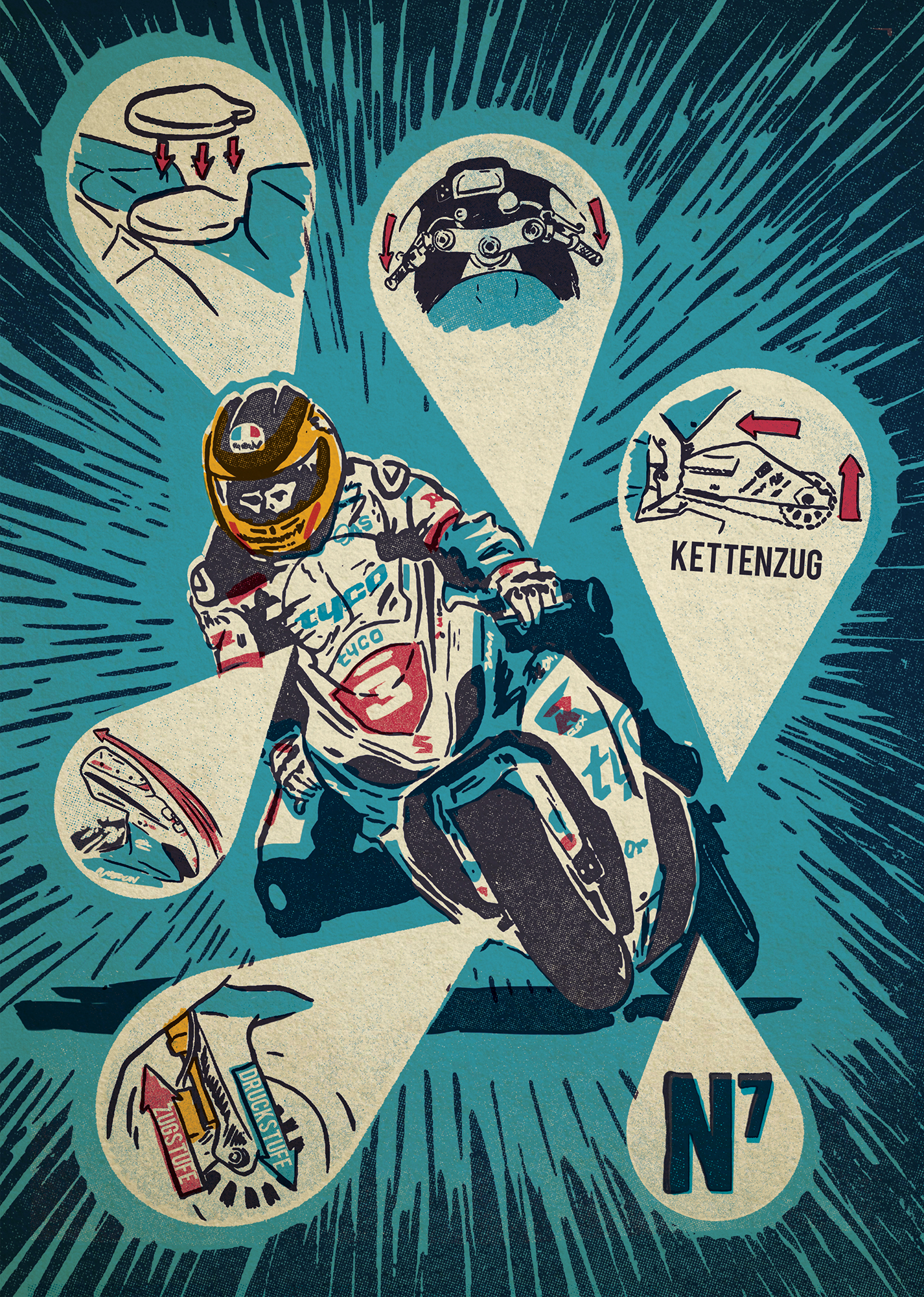
The Triumph riding bandito was fun to do. He’s a dude! The gore riders flat track poster for the DTRA, which was commissioned by Sideburn. That’s probably my most popular piece of work, people seem to love it. Its got it all, speed, dripping type and undead motorcycle riders. But… I really love the Mert Lawwill illustration I did for issue 13. As ever it was a very open brief, and that will always allow for best results. I love the sky and electricity flying off Mert. The colours are really bold and It was just a cracking piece to work on. I did what I wanted really, and it got a great response. So much so that its available as a print in limited numbers.
Aside from Sideburn, what are some of the more interesting commissions you’ve worked on?
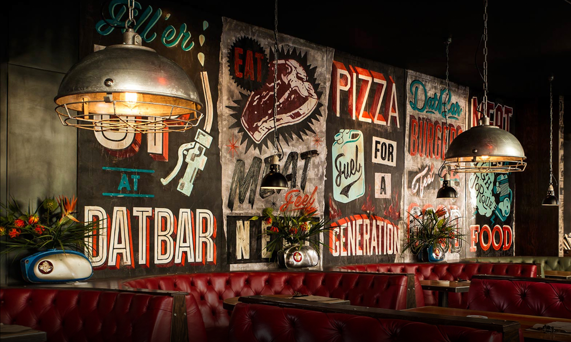
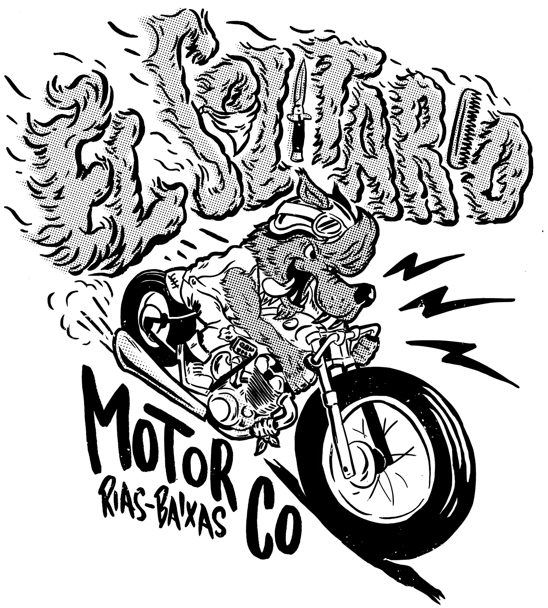
This year I have been lucky enough to work with El Solitario MC. I’m sure most people know about these guys, but really they are such a good bunch to work with. Always open to ideas and pretty much get you on board for your style and don’t try to manipulate it. I hope they continue to grow and push their unique builds on this year. I have recently finished putting together some exciting designs for Roland Sands design 2014 fall collection of apparel. That’s pretty awesome, and again I was free to interpret their brief in my own style. That’s the best when that happens. Anyway, keep an eye out for that because I think its going to be a hellish range of gear. Surely the most exciting and completely different commission this year has been a local bar. Called DatBar a world where a motorcycle riding Sid Vicious flees from giant 50ft women and 50s comic zombies. Custom painted leather jackets hang the walls overlooked by a 1960’s 50cc Moto Morini. Its pretty much what you’d see if you could cut my brain open and delve inside! It was an absolutely 100% open brief, start to finish. This will always produce the best work, and like all of my clients, they pretty much always let me run wild with their projects. And for that I owe a huge amount, so thanks to all of my clients who are happy for me to go wild without questioning it!
Are there any artists out there today that you’re really digging?
Yes, lots. Far too many to mention. I seem to find daily another artist or designer who is out there doing their thing through Instagram. It really is a great platform to promote your work. Anyway… I really appreciate they artists out there doing there thing, in their own way and they have plugged away to make a career out of it. Ornamental Conifer (Nico), constantly impresses me with his painting. I love the mixing of age old advertising techniques and art. There are many others out there doing this, and I have to hand it to the signwriters out there for keeping such a technical and skilled art form alive. But Ornamental Conifer’s work is so unique. The colours and solid, chunky type and patterns are off the scale. I bloody love it. And not a bit of pinstriping in sight! Morning Breath Inc are another bunch who really can’t do much wrong in my eyes. Their use of old style advertising type and characters, layered up to make something fresh from old imagery is brilliant. They really have an appreciation for old advertising ephemera and more importantly, the subtle details in text quality and distress. Its this knowledge that they bring to their work and make something old-time really up to date and fresh. Stevie Gee, he’s a guy doing what he wants. I love how simple some of his illustrations are, coupled with some of the insanely “out there” content, it’s just awesome. Yeah, it’s the content of the imagery that really sets Stevie’s work apart for me. Eye poppin’ bike ridin’ surf board straddling radness.
So what are you working on next? Do you have an upcoming prints, products, or shows we should be watching out for?
I am working on some exciting projects actually, more large scale works. Working larger scale is something I’m really pushing towards now. Its hard to move your work to such a large scale and still keep its style. I have a bunch of upcoming prints actually, and a pile on top of a pile more ideas in my head I want to put out to print. Some motorcycle related, other not. Show wise, I haven’t planned anything quite yet. But it is something I am going to do. Whether solo or collectively, I just think portraying the art side of my work rather than commercial illustrative side will open up new avenues for me to pursue. Keep an eye on my website and Instagram and I will update regularly on the on goings.
If you could travel through time, where would you go?
Straight to the American civil war. I should probably say something about a significant era of a movement in art history or a great period in motorcycle history. Something that would have influenced my work today, but bugger that. I think the American Civil war is just a completely amazing period in history. Crazy contraptions, huge advancements in technology and really it’s JUST out of living memory. The photographs from the time are simply amazing. I cant really put my finger on why I love it so much, especially when really, it didn’t have a direct affect on my own History being here in Blighty. Then I’d take a trip to July 1940, England to watch the Battle of Britain take place in the skies overhead. It must have been such an unusual situation for the farmers and workers in the fields to watch the battle fought out above them. I always wonder, when I see footage of farm workers in the fields and the hurricanes, Spitfires and Messerschmidts fighting it out overhead. Where did all of the ammunition go, because I bet not much actually made it on target. Surely it was raining fire on those fields!! It must have been terrifying to know that the last stand was being fought out by a few young men right above you. Scary to say the least. So, I forgot to mention I’m a complete plane nut too. Well there we go, we left art and bikes behind a bit there. I’m off to scour the internet for my next bike.
Thanks a ton, Ryan, for setting aside some time to speak with me here on Doom Cycle! It’s been an awesome experience, and we all look forward to seeing what you’ll come up with next. Hope we can do this again some time, and keep your eyes on the skies for those damn Messerschmidts (ha!).
